The lack of a standard on what colors to use on HMI screens is a serious problem, because the most of HMI graphic pages depended on the personal taste of the engineer that realized it.
It’s not the first time that i see purple buttons, blue leds and green backgrounds.

Even if there isn’t a written standard on what colors you should choose, there are some “best ways” to design graphic page and make HMIs as helpful as possible.
Some colors that you should consider to use
This is the standard that i use as much as i can:
- Led : green for active, gray for inactive, red for alarm.
- Reserve leds: gray for inactive, red for alarm/reserve.
- Motors and valve: green for active, gray for inactive, red for alarm
- Pipes and tanks: cyan for water, gray empty, other colors if acids or special liquids.
- Momentary buttons: all grays and possibly with windows style and an image associated. All buttons must have a description (don’t use only images); without a description the operator react with somethink like “i wonder what this button does… better not to touch”.
- Toggle buttons: i like UP-DOWN lever switch. A button that stays pushed isn’t a good way on how to represent a switch, and it’s difficult to represent it on a flat panel.
- Alarm banner and log: Red (everything in red should be associated to a wrong condition)
- Background: gray for numerous reasons, like it doesn’t hurt eyes, no problem if there is low light of too much light, all operators are used to see gray backgrounds, gray means inactive – nothing wrong.
- Animations: i use them only when i have to attract the attention of the operator, usually for alarms status or to pay attention at some particular operation. An abuse of animation usually distract the operator from it’s job, so it should be for a good reason (not for animating your logo of course). Think twice before representing bottles that get filled and capped with animations, because the operator is not blind and can see what’s happening inside the filling machine. A good use of animations can be a blinking gray-red led when it is in alarm state, a gauge that is changing value, a small alarm popup in the corner and so on. Remember to use them to attract the attention of the operator.
- Pictures: use ISA symbols or schematic symbols if possible; 3D is your worst friend while representing a plant. It’s important that the operator understand what’s happening, not that he get fashinated.
Exmaple of some bad screens
I took some samples of what i think are bad screens:

Blue background with light green pipes, green and gray tanks and green valves and pumps. Definetly not a good contrast and not good pictures too.

Here pictures are better, but the contrast green on green is still bad. And on top there buttons or tag without a graphic modeling, so i can’t imagine how they can help an operator.
Better screens
This is what i call a useful screen.
with good contrast, not much led and the active ones in green (as you can see you notice them instantly on gray) and alarms in red.
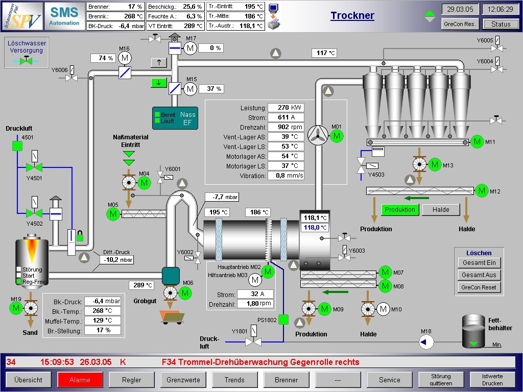
This can be useful too, even if more complex:

Notice the good contrast for liquid levels on tank. I don’t know if components are red because they are not active or in alarms (as i hope), but it’s definetly a good representation.
Interesting article about User Interface
There is a very good article about choosing colors, animations and setting up a Graphical User Interface; you can read it on rollthunder.com – WpfForGoodAndNotEvil.htm
Even if it’s really long, i try to write his points in short:
- First Principle: That the software that you write has zero value in and of itself. You write software for one reason and one reason only: to create value by making the user of your software happier than he would be without your software. The only value that your software ever has or ever will have is the degree to which it increases the happiness of its users. It is extremely rare that users are willing to pay for software that decreases their overall happiness.
-
Second Principle: That computer programs increase the happiness of users in one of two ways. The majority of applications help a user solve a specific problem – writing an email message or an article, buying groceries or an airplane ticket, viewing a bank statement and paying bills. The user’s only goal in using this type of program is to finish the task and get on with his life, or at least on to the next task. The faster a program converts a task from not-finished to finished, the happier the user will be.
The second way in which a program increases a user’s happiness, less common than the first, is by putting the user into a pleasurable state that he wants to maintain as long as possible, or at least as long as it remains pleasurable, like Games.
- Third Principle: That in neither of these cases do users want to think about the programs they are using. At all. Ever. In the former case, they want to think about the problem they are solving: the wording of the document they are writing, or whether they have enough money to pay their bills, and which unpaid creditor would hurt them the most. They don’t want the program to distract them from the problem they’re thinking about. If they want to goof off and waste time, they’ll bring up Solitaire, not admire the flashing video buttons in the word processor.
The point that i liked the most is this one: Motion attracts a user’s attention. Natural selection brutally pounded that design pattern into the human brain and visual system. Our savannah-based ancestors that noticed the twitch of the saber-tooth tiger behind the tall grass avoided being eaten and passed their attentive genes on to their descendants. The ones who didn’t notice the motion got eaten, and didn’t. Every single user is the inheritor of roughly 13,000 generations of homo sapiens who noticed motion better than the ones who didn’t make it.
[…]As user interface expert Jared Spool wrote of his test of a Disney web page containing an animated logo, that corporate branding icon so beloved of marketeers everywhere: “Users first tried to scroll the animation off the page, and when they couldn’t, actually covered it up with their hands so they could read the rest of the text.”
I really reccomend to check this article, is well written and with tons of examples.
Great article. So many horribly designed HMIs. If I could go into business of just creating greatly designed HMI programs, I totally would!
IMHO, all four screens are poorly designed. Their main problem is not in coloring, but in relying heavily on digital (text) readouts and having no analog bars except for liquid levels, no embedded trends, either. The operator is given data, not information. You can’t read the current state of the plant at a glance. These screens won’t look any different even if some values are far out of their normal range.
I agree on you with the design, but the article talks about colors and shows how some choice are obviously better than others.
I didn’t write about how to present automation data to the operator, because it’s quite an advanced topic and also it depends on the process that you are automating.
I find your comments and suggestions great! thanks for taking the time to share them with us
I am sorry, but your choice of colours is wrong. Red and green cause ambiguity for red green deficiency users. Read isa101. They recommend shades of grey, no motion, and no 3d sculpted graphics.